Finally collapsing onto my bed after a long day in March— the month of sleepless nights and early mornings—I sit up to painfully begin the piles of work due tomorrow.
I spent lunch in the library— despite my desperate need for sunlight— sending an email begging for an extension on a project, but have still not received a reply. Through my half opened and slightly teary eyes, I drag my body across my bed, open my laptop and anxiously refresh my inbox— one new message.
Could it be the email the I have long been awaiting? Anticipation tingling in my fingertips, my blurry vision manages to make out the sender of the email: “Jane Doe.” Not my teacher.
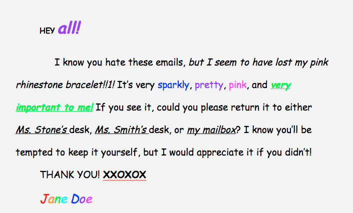
With a sigh, I click on the bolded words in my inbox and see the following:
I am truly sorry if you lose something you care about, honestly, I am—we have all been there. And furthermore, we are ALL guilty of creating some sort of highly energetic or decorated text in an email, website, poster, etc… but when it comes to our school email in which we receive important and professional information, could we please agree on a few things?
For example, Comic Sans seriously needs to go. For colorful posters and Facebook posts, go ahead, use it until your little heart can’t take it anymore—but if you are trying to get across a message that means something to you, Comic Sans is a bit like a five-year-old watching Sunday Morning Cartoons and finding “I tawt I taw a puddy tat!” the funniest thing they have EVER heard… sixteen times.
Also, can we agree that saying “I know you hate these emails” does not change a single thing? Just accept that people may be annoyed and get on with it. Stick to the point, and I will actually keep reading, you have my word.
Could we also limit the amount of colors in these emails to preferably one, but no more than two? Bright colors do nothing for my headache, and as I read your email with the purpose of seeing if I can help you, the bright greens and blues just make me want to quit the page. I would appreciate not feeling like I am deciphering the visual representation of a ’90s rave every time I enter my inbox. Making the content complicated and animated does not help get your point across, it just makes sirens go off in my head.
And on a practical note, before you even send an email, make sure you have gone to the Upper and Middle School desks, checked your mailbox, your locker, with your friends, in the bathrooms and in your classrooms. If by then you still cannot find what has been misplaced, than please wait at least another day and check again. It may not be a happy thought, but if you cannot find your item yourself, chances are, sending an email will not help.
*Sigh*
This has been a PSA.
Featured Image created by Sara Seaman ’16









Dr. Yoshimura • Apr 11, 2014 at 11:03 pm
I would add to the suggestions that one cease to put false subject lines, like “Free Food!” only to embark on a plea for a lost item. It’s disingenuous.
Marcela Riddick • Apr 16, 2014 at 5:04 am
That doesn’t just apply to this kind of email. I think it is something that students sending out mass emails should be conscious of.
Granted, it may be the “only” way get students to read emails. But that’s another issue isn’t it?
Rosemary Pastron • Apr 11, 2014 at 5:50 pm
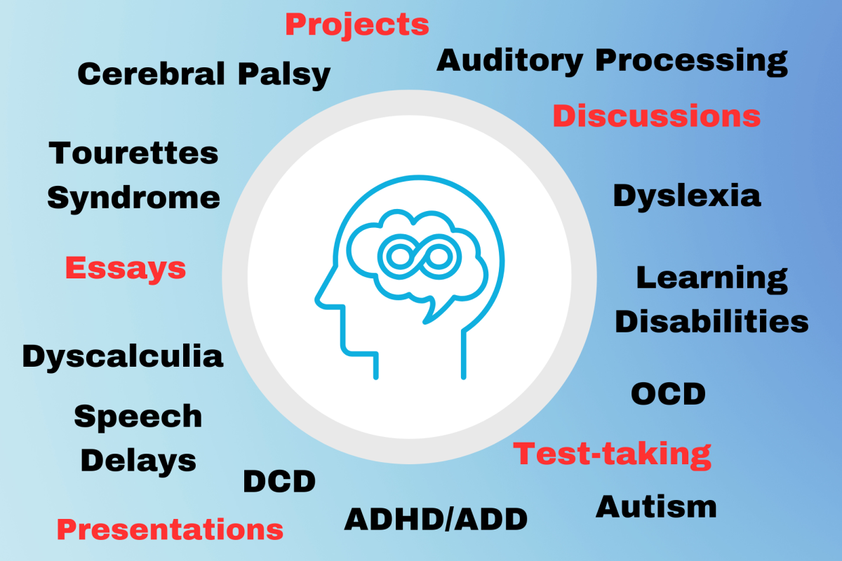
This is a funny article; it’s true and needs to be said. But..for the comic sans..the font was actually created to be easier for dyslexic people to read. So while it can look a little unprofessional or childish, it’s slightly ableist to say its a ‘bad’ font. Just putting that out there…