
On the HERizon: Yearbook theme ‘celebrates’ change, growth, opening of Diana Meehan Academic Center
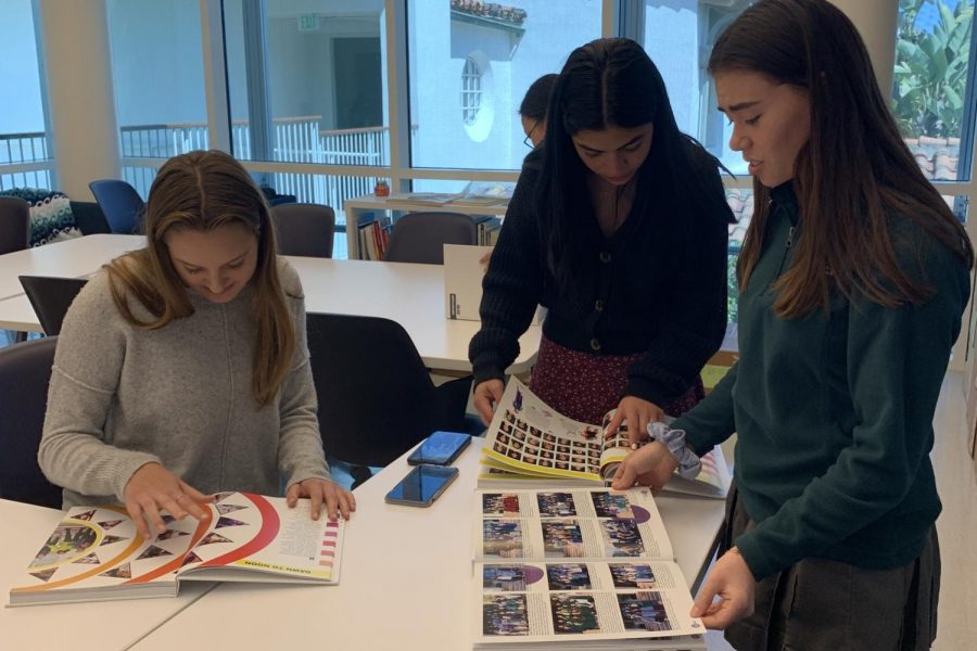
Photo credit: Kristin Taylor
Yearbook copy editor Abigale Lischak ’20, photo editor Yasi Gohar ’20, and sales manager Julia Wanger ’20 flip through the pages of this year’s yearbook. The theme of the book is “HERizon”.
Students flooded the publications lab on Wednesday, May 29, to pick up their yearbooks on distribution day. Filled with pictures, interviews and features on different parts of the school year, these 232 pages serve as a living time capsule that memorializes the events of the 2018-2019 school year.
Curated and constructed by the Hestia’s Flame yearbook staff, the books are white with dark gray and gold trimming. The theme of this year’s book is “HERizon,” representative of Archer’s location on Sunset Boulevard and the opening of the Diana Meehan Academic Center.
“I wanted to create a book that was really unique to the Archer experience. A major part of that is the fact that we are on Sunset Boulevard because it’s where our school is located, and it affects our lives every day both getting to and leaving school,” Editor-in-Chief Siena Mizel ‘20 said. “I thought that it would be fun to design a theme around our location, and then the sunset theme just evolved from there, especially because of the amazing sunsets in California.”
Junior Julia Wanger echoed this sentiment, explaining that both the title and the visual design of the book have “special” meanings. Wanger was the yearbook sales manager this year and will serve as co-editor-in-chief with Mizel next year.
“We purposely spelled horizon as HERizon throughout the book to make the theme more personal to our school and Archer girls specifically,” Wanger said. “In terms of design, we used circles to symbolize the sun and a vibrant color scheme that mirrors a sunrise and sunset.”
The format of the book is different from others in the past. Usually, the book is divided into four seasons, but this year it is separated by months. Wanger said that the team made this decision in the hope that they would be able to cover more stories and events throughout the year. There are five spreads for each month: student life, academics, sports, arts and an additional special spread that spotlights both current events and major school-wide events, such as Color Wars.
“My favorite part about the yearbook this year is the consistency of our theme throughout the book,” Wanger said. “It was definitely challenging to get used to this new format, but looking back, I’m really happy that we decided to divide the book into months.”
Mizel also believes that the “consistency” of the theme and design of the book are the most “memorable” parts about it.
“You can open any page of the yearbook and see our theme splashed across it, and the vibrant colors really add to the overall joy that this book brings,” Mizel said. “I think that this is by far our best book in multiple ways. Our design overall was elevated and very consistent throughout the book, and I feel that it captured the whole picture of Archer that people will want to remember in the future.”
Mizel said that her biggest goal for the book was to make sure that it tells a story that every Archer student can relate to.
“We make the book not just to highlight the super involved students, but to also tell the common story of the year that every Archer girl experienced. We want everyone to look through it and be able to relate in some way,” Mizel said, “whether it’s seeing their art featured, having a great sports shot of them printed in the book or just seeing one of their favorite Archer events covered in a way that they can always remember and appreciate it.”

Molly Goldberg joined the Oracle staff in 2017 as a staff writer and was promoted Sports Editor for her junior year. This year, she is excited to fill...